728x90
반응형
SMALL
Z-INDEX

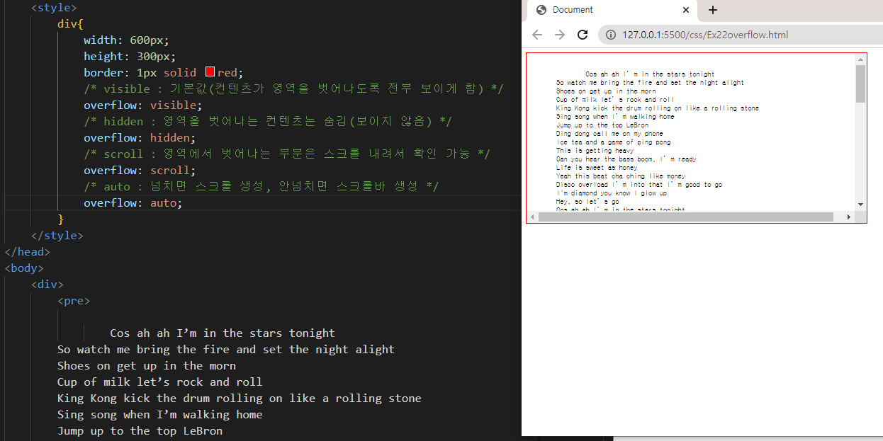
overflow
<종류>
- visible : 기본값
- hidden : 영역을 벗어나는 컨텐츠 보이지 않게함
- scroll : 영역에서 벗어나는 부분은 스크롤 생성
- auto : 영역 벗어나면 스크롤, 안넘치면 스크롤바 생성
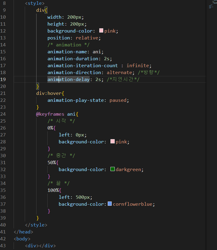
애니메이션 만들기
- style태그
- animation-nameanimation : 이름 지정 하기
- position : relative 로 지정
- animation-duration : 몇초간격으로 둘건지 (애니메이션 생명주기)
- animation-iteration-count : infinite; -> 무한반복
- animation-direction=alternate; -> 애니메이션 방향지정(alternate : 왔다갔다)
- animation-delay -> 애니메이션 지연시간
- animation-play-state: paused -> 애니메이션 정지
- 애니메이션 주요 키 : @keyframes 이름
- 0% : 애니메이션 시작
- 50% : 애니메이션 중간
- 100% : 애니메이션 끝
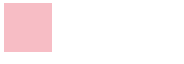
움직이면서 색깔변화 애니메이션
1
2.

3.

코드
도형2개 위아래 움직이며 모양변화
1.
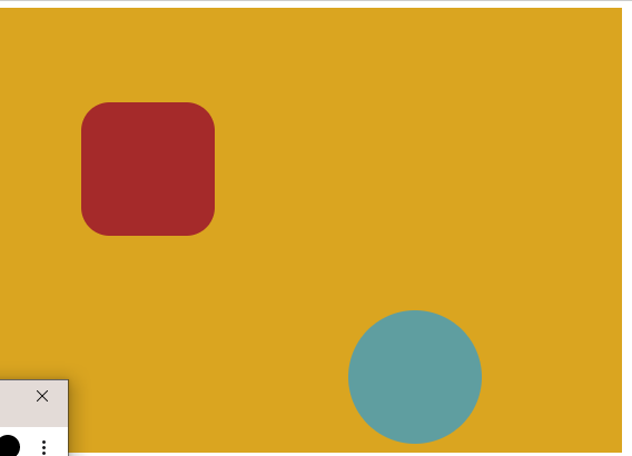
2.
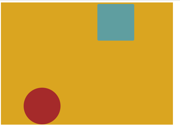
내가 짠 코드
<!DOCTYPE html>
<html lang="en">
<head>
    <meta charset="UTF-8">
    <meta http-equiv="X-UA-Compatible" content="IE=edge">
    <meta name="viewport" content="width=device-width, initial-scale=1.0">
    <title>Document</title>
    <style>
        .d1{
            width: 700px;
            height: 500px;
            top: 0px;
            background-color: goldenrod;
            margin: 0px;
        }
        .d2{
            width: 150px;
            height: 150px;
            background-color: brown;
            position: absolute;
            top: 357px;
            left: 100px;
            z-index: 2;
            animation-name: ani1;
            animation-duration: 2s;
            animation-iteration-count : infinite;
            animation-direction: alternate;
        }
        .d3{
            width: 150px;
            height: 150px;
            position: absolute;
            background-color:cadetblue;
            z-index: 3;
            top: 357px;
            left: 400px;
            animation-name: ani2;
            animation-duration: 2s;
            animation-iteration-count : infinite;
            animation-direction: alternate;
            animation-delay: 2s;
        }
        @keyframes ani1{
        0%{
            top:0px;
        }
        100%{
            bottom: 500px;
            border-radius: 100px 100px 100px 100px;
        }
    }
    @keyframes ani2{
        0%{
            top:0px;
        }
        50%{
            border-radius: 50px 50px 50px 50px;
        }
        100%{
            bottom: 500px;
            border-radius: 100px 100px 100px 100px;
        }
    }
    </style>

</head>
<body>
    <div class="d1"></div>
    <div class="d2"></div>
    <div class="d3"></div>
</body>
</html>
728x90
반응형
LIST
'스마트인재개발원 > HTML,CSS' 카테고리의 다른 글
| [CSS] 스타일시트 선언 종류 / 사용 방법/ 우선순위 ( 인라인스타일|내부스타일|외부스타일|임포트방식) (0) | 2022.10.06 |
|---|---|
| [CSS]position - static/relative/absolute/fixed 정의, 사용법 (1) | 2022.10.05 |
| [CSS] border/ margin/ padding 예제 (1) | 2022.10.04 |
| [CSS] display(block,inline,inline-block,none )활용도 / grid / 관련 게임 (1) | 2022.10.04 |
| [CSS]계층 선택자 / 반응 선택자 (0) | 2022.10.01 |


